Assignment 4
The total grade of the assignment will be divided in this way:
- 20% - Task 1
- 70% - Task 2, sections 2-7
- 10% - Task 2, sections 8 and 9
Submission instructions
To convert your notebook to PDF, we will first convert your notebook to HTML, and then save as PDF.
Open your notebook in VS code.
Select the three dots at the top of your notebook.

- Select Export > HTML (not pdf)
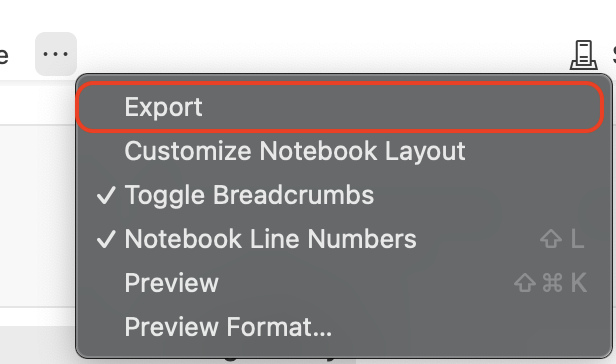
Choose where you want to save this HTML to your computer
Open up the html and go to File > Print > Save as PDF
Save your PDF as `
hwk4-task2-false-color-YOURLASTNAME.pdfand submit to Gradescope.
Task 1: The politics of pixels reading
When working with satellite data, it’s easy to assume that it is inherently objective and equally accessible to everyone. However, Bennett et al., in their paper The Politics of Pixels: A Review and Agenda for Critical Remote Sensing (2022 [1]), challenge this assumption, arguing that remote sensing needs a critical lens. They emphasize that various sociopolitical factors influence who collects remotely sensed data, how it’s collected, and ultimately, who benefits from its insights. This reading will encourage you to explore the biases and inequalities that can be embedded in remote sensing technologies and practices.
Read the paper and write a one-paragraph (between 100 and 150 words) reflection about it. This paper is a bit denser than the others we’ve read, section V is worth special attention. Review the rubric for this assignment here. Answer at least one of the following questions for your reflection:
Reflecting on your personal or professional background, how might sociopolitical factors shape the availability and interpretation of satellite and other remotely sensed data for communities or organizations you’re familiar with?
What potential ethical responsibilities arise for environmental data scientists when working with remote sensing data that may carry biases or limitations?
If you were tasked with implementing remote sensing for a project, what steps might you take to ensure the data collected is fair, accessible, and unbiased?
Task 2: Visualizing fire scars through false color
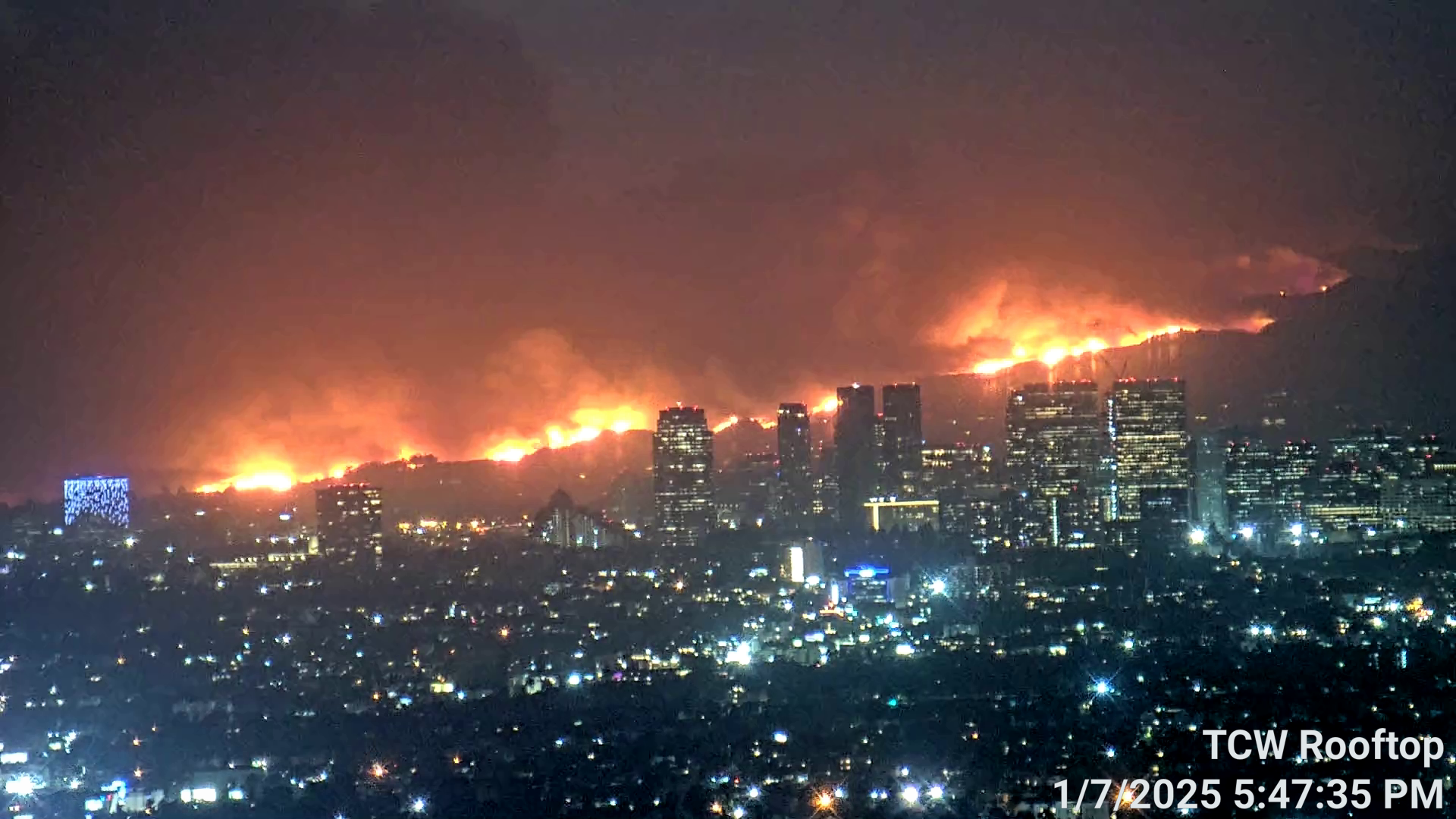
In early January 2025, the Eaton Fire and Palisades Fire erupted nearly simultaneously in the foothills and coastal wildland-urban interface zones of Los Angeles County, fueled by powerful Santa Ana winds Together, they devastated thousands of homes, displaced tens of thousands of residents, and inflicted severe ecological and infrastructural damage.
False color imagery, created using satellite data from instruments like Landsat, is a useful tool for monitoring wildfire impacts. By assigning infrared bands to visible colors, these images highlight vegetation health, burn severity, and the extent of fire scars. This approach helps researchers and land managers assess recovery efforts, identify high-risk areas, and plan restoration strategies.
In this task, you will create a false color image of the Eaton and Palisades Fires using remote sensing data, highlighting the fire scar and exploring how coding and data visualization support environmental monitoring.
About the data
In this task you will use two datsets. The first is a simplified collection of bands (red, green, blue, near-infrared and shortwave infrared) from the Landsat Collection 2 Level-2 atmosperically corrected surface reflectance data, collected by the Landsat 8 satellite.
The data was retrieved from the Microsof Planetary Computer data catalogue and clipped to an area surrounding the fire perimeters. This data should be used for visualization and educational purposes only and can be accessed at the landsat8-2025-02-23-palisades-eaton.nc in the course shared data Google Drive.
The second dataset will be fire perimeters for the Eaton and Palisades fires. There are several datasets with this information online. You will need to independently select one from a reputable source (it may be more than one file).
Setup
Instructions
1. Reading
Read the following resources about false color images and Landsat imagery:
2. Fire perimeter data exploration
Explore the fire perimeter data and write a brief summary of the information you obtained from the preliminary exploration. Your summary should include, at least, the CRS of the data and whether this is projected or geographic.
3. NetCDF data import and exploration
On the terminal:
Activate the EDS 220 conda environment and verify it is active.
Install the netCDF4 package in the EDS 220 environment by running
conda install -c conda-forge netcdf4- Verify that the
netcdf4package was installed.
In your notebook:
Import the Landsat data using
xr.open_dataset().Explore the data and write a brief summary of the information you obtained from the preliminary information. Your summary should include the a description of the data’s variables, dimensions, and coordinates.
4. Restoring geospatial information
Use
rio.crsto print what is the CRS of this dataset. Is this a geospatial object?You may have noticed on section 3 that the geospatial information for this dataset is stored in the variable
spatial_ref. Print the CRS by using accesing thespatial_ref.crs_wktattribute of the dataset.Recover the geospatial information by using
rio.write_crs()and the spatial reference information form part b.Print the CRS of the updated dataset.
5. True color image
- Without creating any new variables:
- select the red, green, and blue variables (in that order) of the
xarray.Datasetholding the Landsat data, - convert it to a
numpy.arrayusing theto_array()method, and then - use
.plot.imshow()to create an RGB image with the data. There will be two warnings, that’s ok.
Adjust the scale used for plotting the bands to get a true color image. HINT: Check the
robustparameter. The issue here is the clouds: their RGB values are outliers and cause the other values to be squished when plotting.To resolve the other warning, identify which bands have
nanvalues. HINT: There are many ways of doing so. One option is to usenumpy.isnan().Use the
.fillna()mehtod forxarray.Datasets to substitute the anynanvalues in the Landsat data for zero.Create a new true color image that gets plotted without warnings.
In a markdown cell write a brief explanation comparing the ouputs for parts (a) and (e).
6. False color image
Without creating any new variables, create a false color image by plotting the short-wave infrared (swir22), near-infrared, and red variables (in that order).
7. Map
Create a map showing the shortwave infrared/near-infrared/red false color image together with both fire perimeters. Customize it appropriately including, at least, an informative title and legend. You may also want to include text on the map to identify which fire is which.
Write a figure description for the map including a brief explanation of how false color imagery is being used.
8. Clean your notebooks
The target audience for your notebooks is a fellow EDS 220 student who is just learning about wrangling raster data using Python.
- Add enough and appropriate comments to explain your code.
- Add enough and appropriate markdown cells to explain the procedures you are using and their output.
- First cell in the notebook must be a markdown cell including:
- Each notebook must include an “About” section with the following subsections:
The rest of your notebook should be organized into logical subsections (indicated through markdown headers) for the analysis and visualization you are performing. The subsections should easily guide the reader through the analysis.
9. Update your repository
Update your repository’s README with (at least) the following (based on EDS 296):